5. JASP: Visualization and Correlation
In block 1 we aim to:
- Discuss NHST concepts
- Introduce JASP
- Correlation
- Linear model (regression)
Reading: Chapters 1-8.8
In this lecture we aim to:
- Introduce JASP
- Descriptive statistics
- Data visualizations
- Correlation
Reading: Chapters 4, 5, 7
JASP
Why JASP?
- User-friendly, intuitive interface
- Open-source (free)
- Reproducible analyses (easy to share)
- Better than IBM’s SPSS for transparency and workflow
- Integrates with R for advanced users
![]()
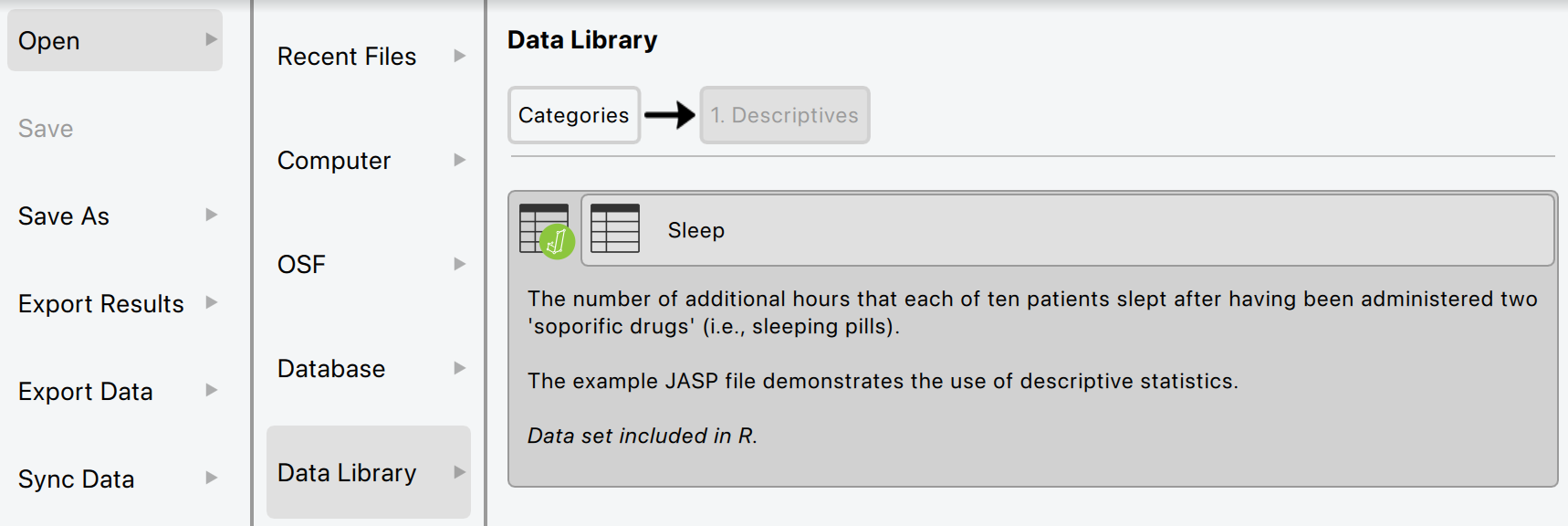
Getting Started with JASP
- Download from jasp-stats.org
- Open JASP, load your dataset (.jasp, .csv, .sav, etc.)
- Familiarize with the interface: Data view, Input panel, Output panel
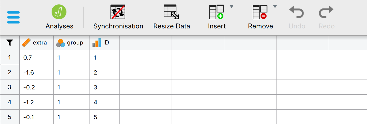
Loading Data in JASP
- Click Open > select your file
- Data appears in spreadsheet view
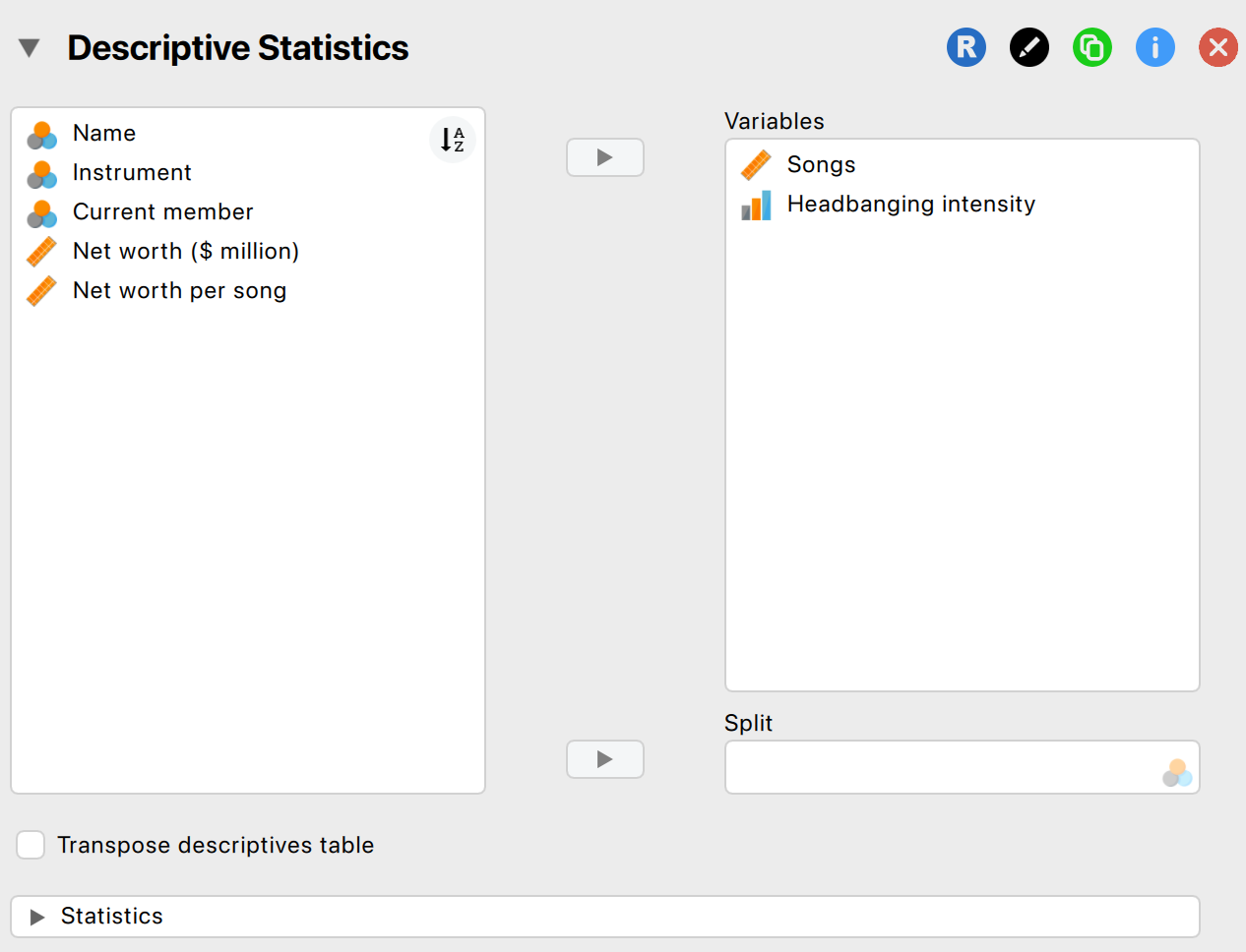
Descriptive Statistics in JASP
- Go to Descriptives > select variables
- Options: mean, median, SD, min, max, quartiles
- Output updates instantly
Some special operations
- Filtering data
- Split variable in Descriptives
Getting help
- JASP Video Library
- The book

Visualization
Data visualization
Why Visualize Data?
- Quick overview of the data
- Spot patterns, outliers, or errors
- Invite the reader
Why Visualize Data?
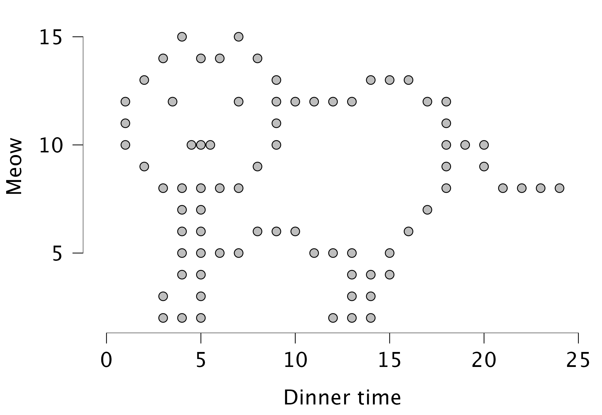
Different types of graphs in JASP
- Distribution plots (basic plots)
- Frequency plot when nominal
- Histogram when scale/ordinal
- Correlation plots (basic plots)
- Scatter plots (customizable plots)
- Raincloud plots
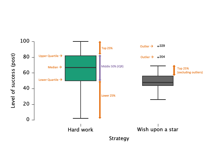
Boxplots: Visualizing Spread and Outliers
- Shows median, quartiles, and outliers
- Useful for comparing groups
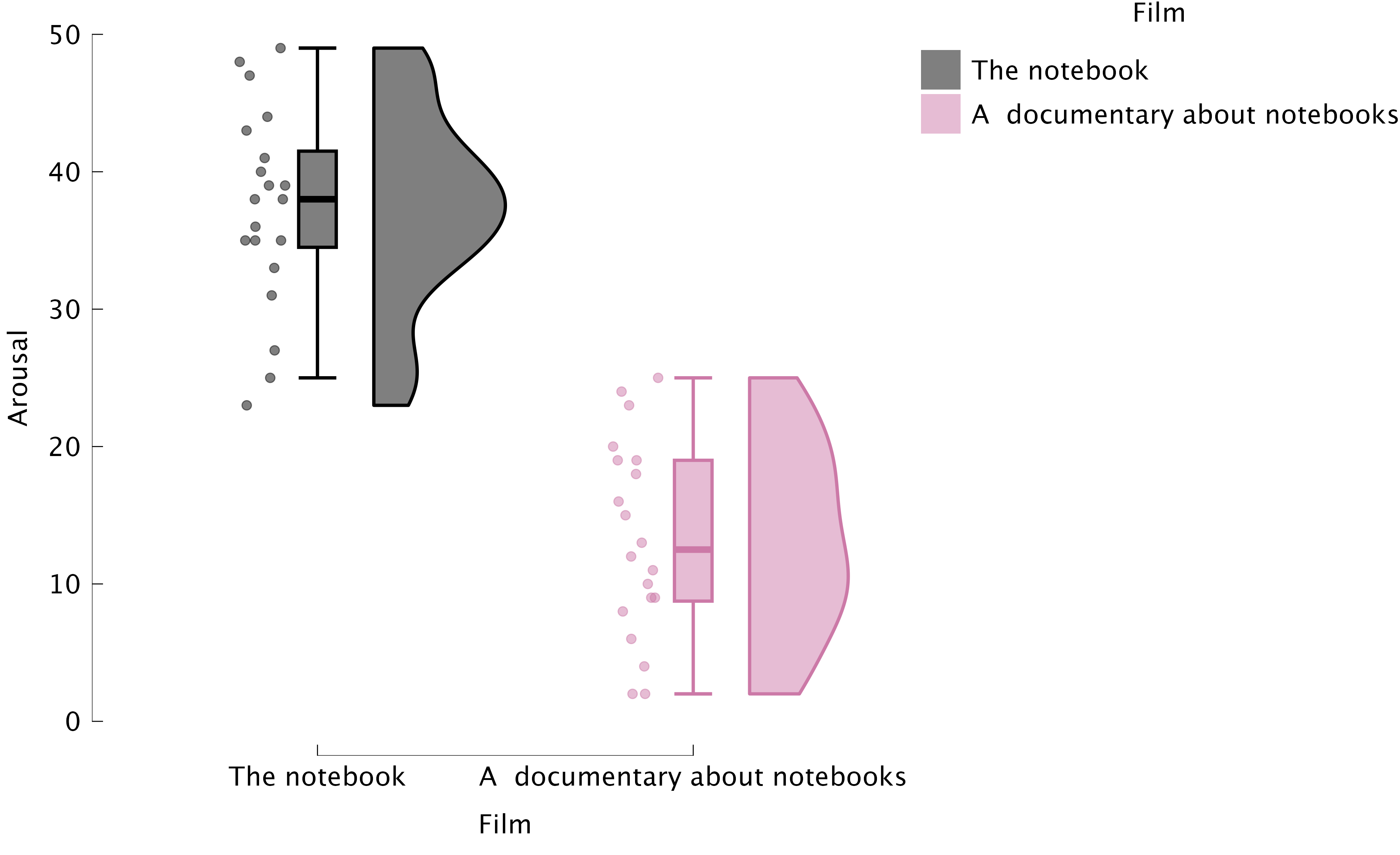
Raincloud plots: Boxplots + Raw Data
Best Practices in Data Visualization
- Use clear labels and titles
- Avoid unnecessary 3D effects
- Choose appropriate scales
- Check for misleading representations
Critically Assess Graphs
- Are axes labelled (variable, units)?
- Are axes broken/equally spaced?
- Are error bars (e.g., confidence intervals) included where relevant?
Critically Assess Graphs
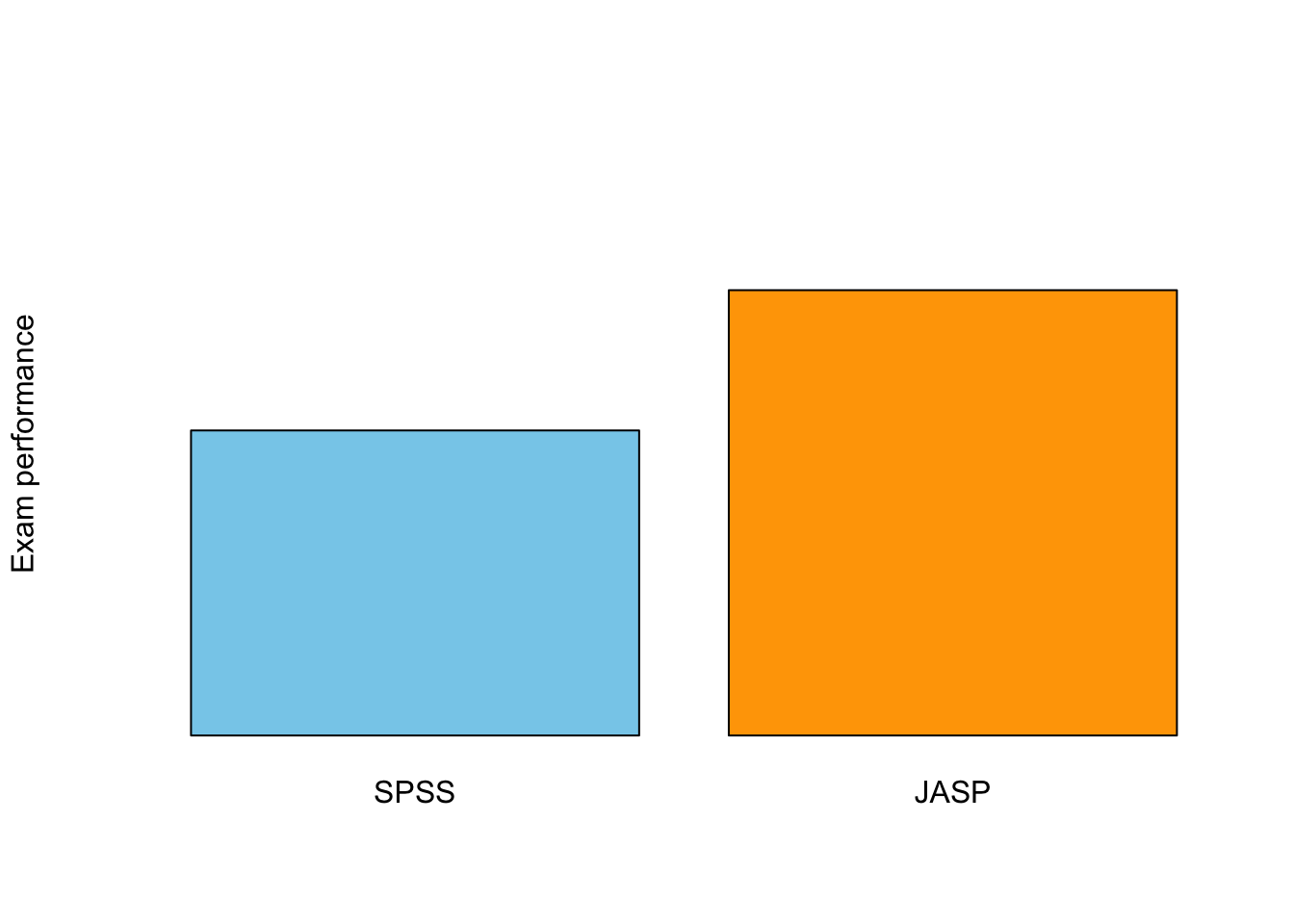
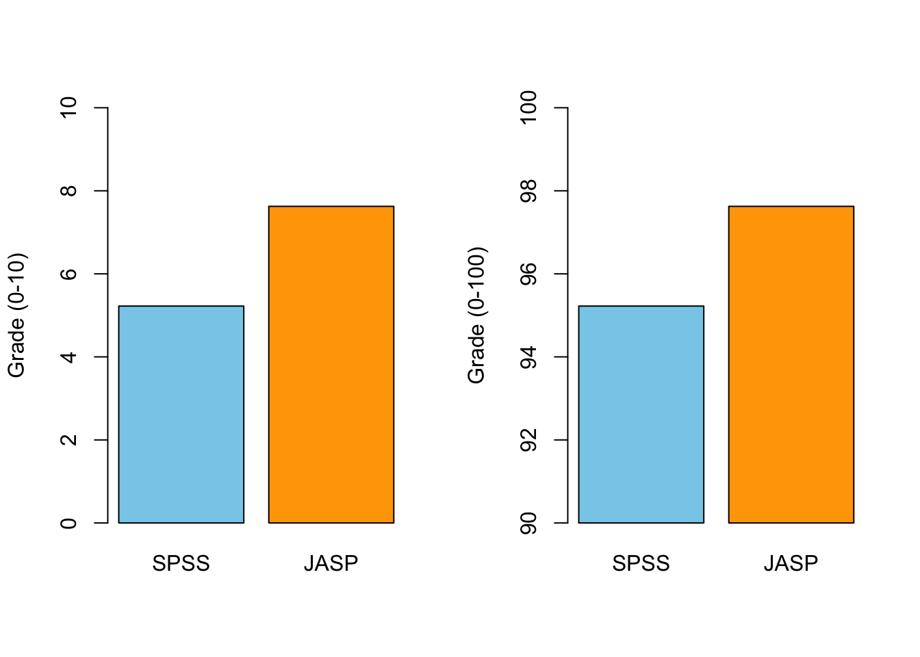
Scale Matters
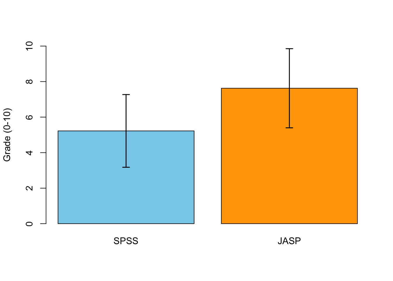
Error Bars!
Correlation
Pearson Correlation

In statistics, the Pearson correlation coefficient, also referred to as the Pearson’s r, Pearson product-moment correlation coefficient (PPMCC) or bivariate correlation, is a measure of the linear correlation between two variables X and Y. It has a value between +1 and −1, where 1 is total positive linear correlation, 0 is no linear correlation, and −1 is total negative linear correlation. It is widely used in the sciences. It was developed by Karl Pearson from a related idea introduced by Francis Galton in the 1880s.
Source: Wikipedia
Pearson Correlation
\[r_{xy} = \frac{{COV}_{xy}}{S_xS_y}\] Where \(S\) is the standard deviation and \(COV\) is the covariance.
\[{COV}_{xy} = \frac{\sum_{i=1}^N (x_i - \bar{x})(y_i - \bar{y})}{N-1}\]
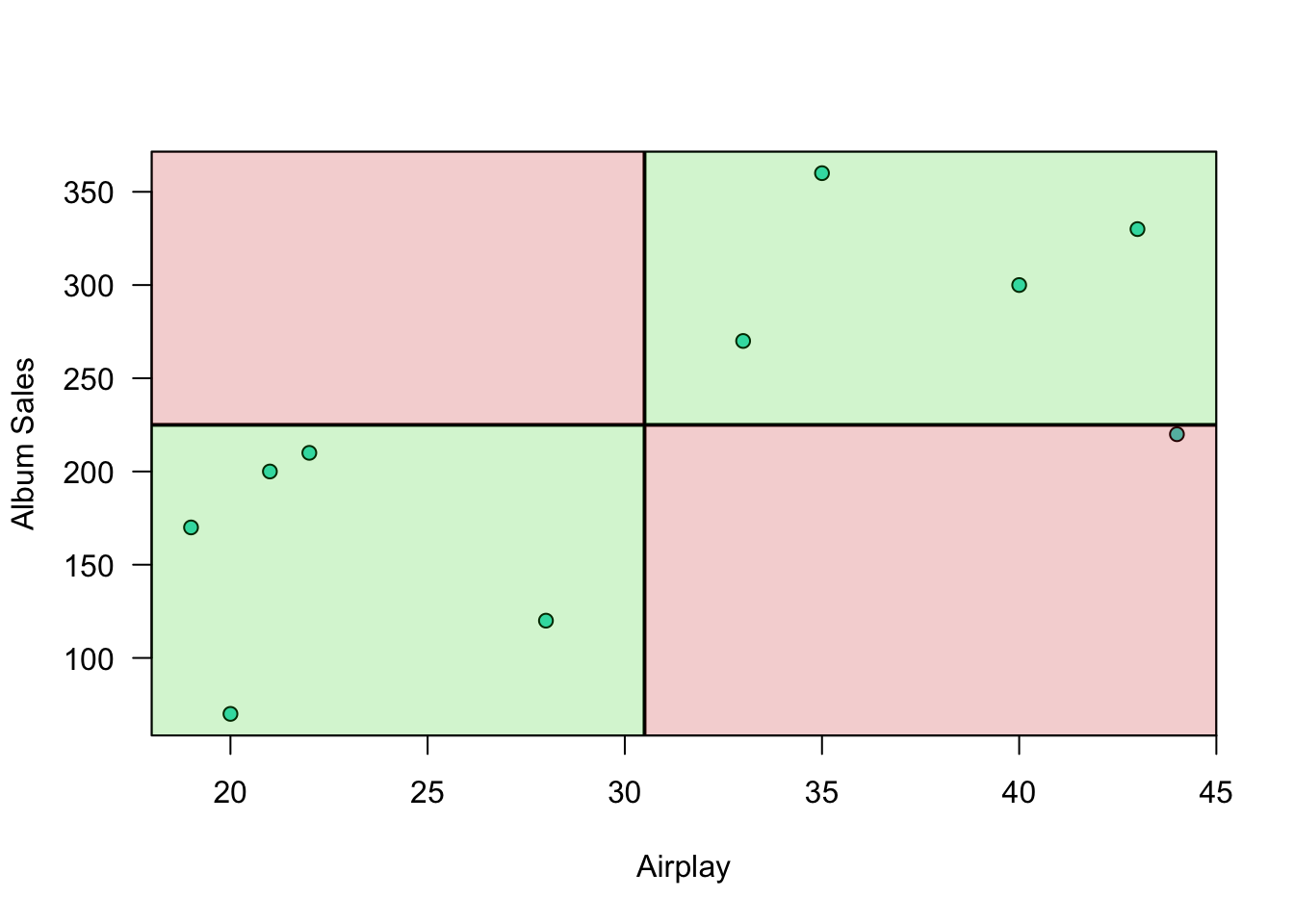
Plot correlation
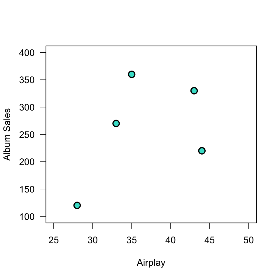
Plot correlation
Plot correlation
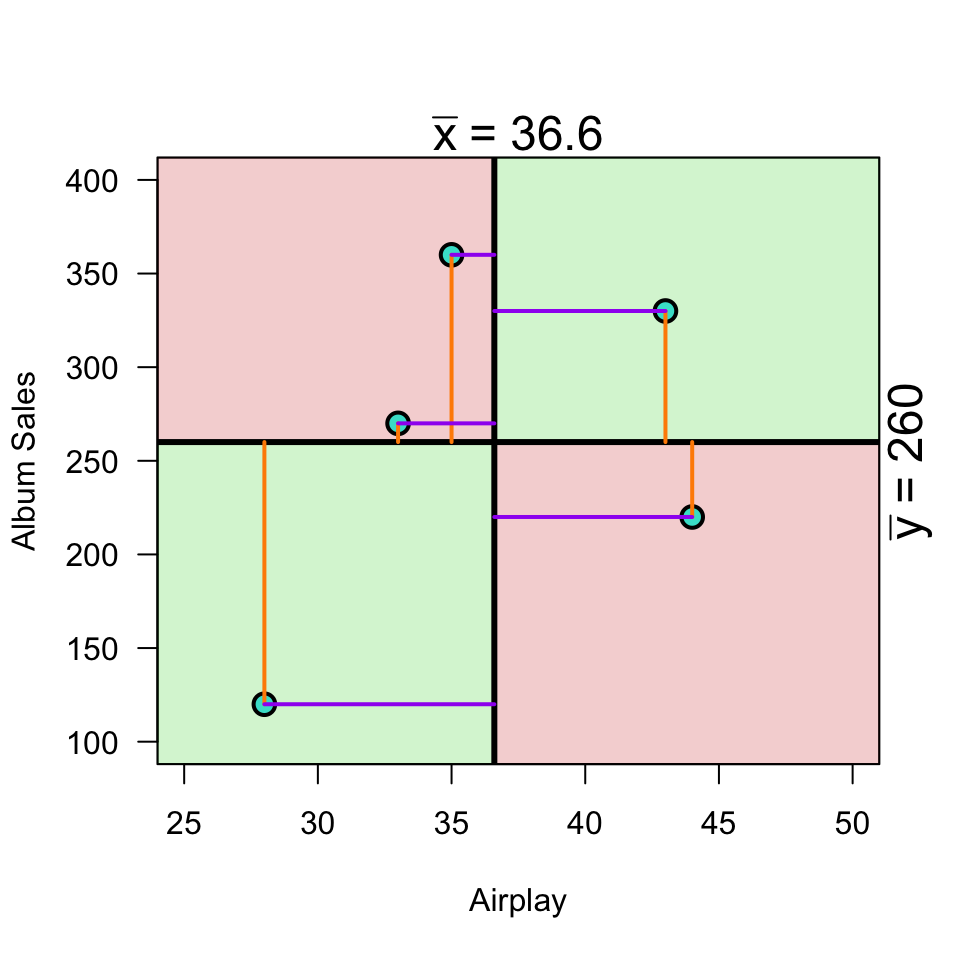
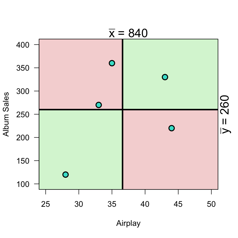
\[(x_i - \bar{x})(y_i - \bar{y})\]
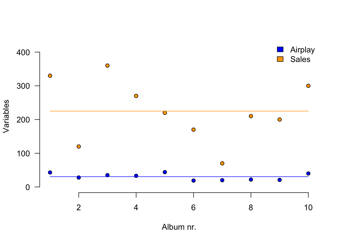
Load data
n     <- 10
data <- read.csv("../../../datasets/Album Sales.csv")[, -4]
data <- data[1:n, ] # take the first 10 rows of the album sales data set from Field
DT::datatable(data, rownames = FALSE, options = list(searching = FALSE, scrollY = 415, paging = F, info = F))
Variance
Standardize
\[z = \frac{x_i - \bar{x}}{{sd}_x}\]
z.sales      <- (data$sales   - mean(data$sales))   / sd(data$sales)
z.airplay    <- (data$airplay - mean(data$airplay)) / sd(data$airplay)
Standardize
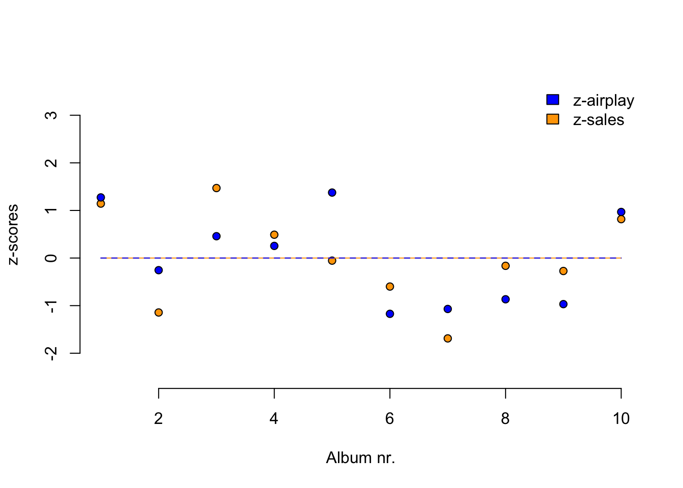
Standardize
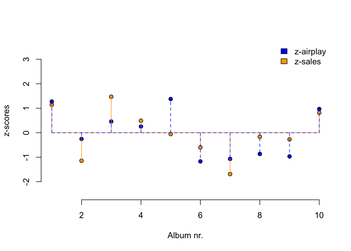
Covariance
\[{COV}_{xy} = \frac{\sum_{i=1}^N (x_i - \bar{x})(y_i - \bar{y})}{N-1}\]
mean.sales      <- mean(sales, na.rm=TRUE)
mean.airplay    <- mean(airplay, na.rm=TRUE)

delta.sales     <- sales - mean.sales
delta.airplay   <- airplay - mean.airplay

prod <- (sales - mean.sales) * (airplay - mean.airplay)

covariance <- sum(prod) / (N - 1)
covariance
[1] 618.3333Correlation
\[r_{xy} = \frac{{COV}_{xy}}{S_xS_y}\]
correlation <- covariance / ( sd(sales) * sd(airplay) ); correlation[1] 0.6864408correlation[1] 0.6864408Correlation
\[r_{xy} = \frac{{COV}_{xy}}{S_xS_y}\] \[{COV}_{xy} = \frac{\sum_{i=1}^N (x_i - \bar{x})(y_i - \bar{y})}{N-1}\]
cor( sales, airplay) # correlation[1] 0.6864408cor(z.sales, z.airplay) # correlation of z-scores[1] 0.6864408# covariance of z-scores
sum(z.sales * z.airplay ) / (N - 1)[1] 0.6864408Plot correlation
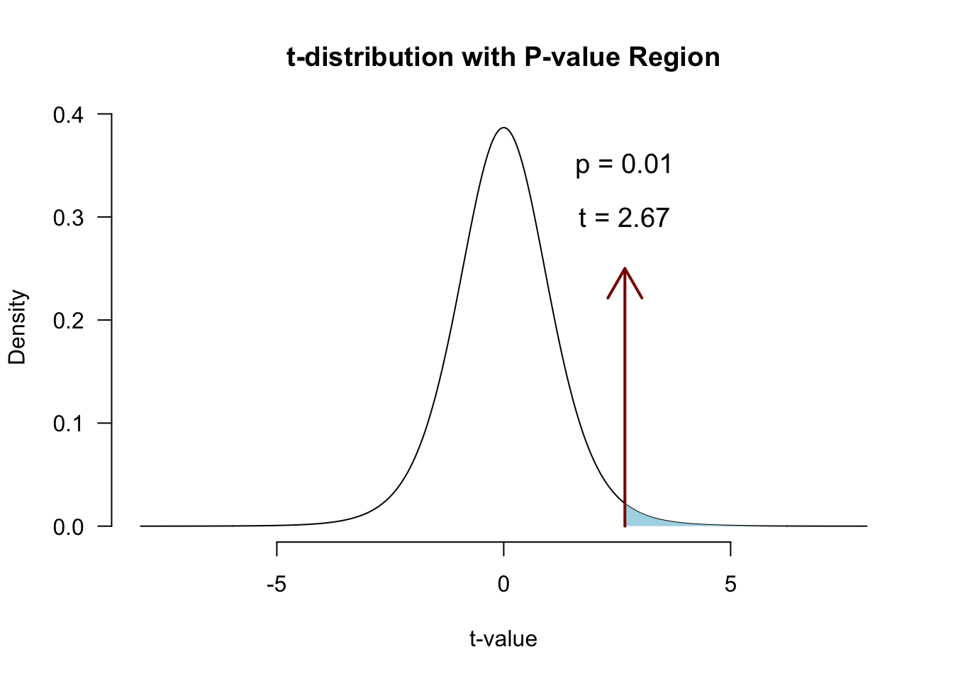
Significance testing using \(t\)
A test statistic with a known probability distribution (the t-distribution).
It’s a standardized measure of how closely our observed statistic matches the value claimed by \(\mathcal{H}_0\):
\[t = \frac{\text{estimate} - \mathcal{H}_0 \text{ value}}{\text{SE}(\text{estimate})}\]
Significance of a correlation
We convert \(r\) to a \(t\)-statistic because \(t\) has a sampling distribution: the \(t\)-distribution with df = N-2:
\[t_r = \frac{r \sqrt{N-2}}{\sqrt{1 - r^2}}\]
\[{df} = N - 2\]
Hypotheses for \(t\)
\[ \begin{aligned} H_0 &: t_r = 0 \\ H_A &: t_r \neq 0 \\ H_A &: t_r > 0 \\ H_A &: t_r < 0 \\ \end{aligned} \]
\(r\) to \(t\)
df  <- N-2
t.r <- ( correlation*sqrt(df) ) / sqrt(1-correlation^2)

t.r
[1] 2.669948df[1] 8Visualize
Locate in \(t\)-distribution
Closing
Next Week
- Partial correlation
- The linear model
- Predictions
- Assumptions
- Fun
Recommended Exercises
Exercise 7.1, Exercise 7.6, Exercise 7.7
- Note:
pets.jaspcan also be downloaded from the Data page
- Note:
Contact
